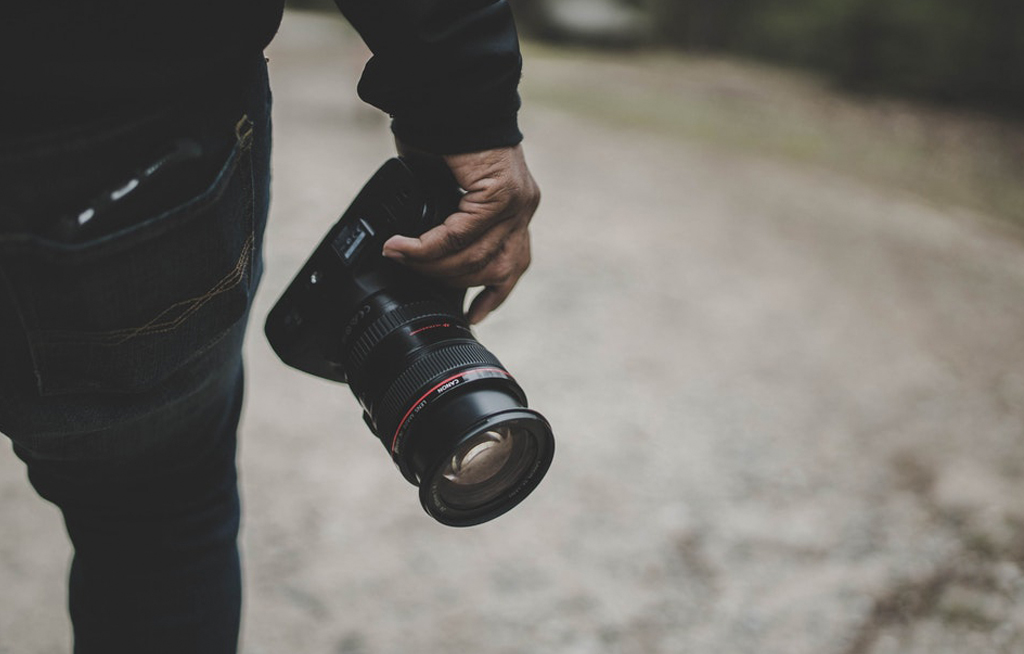
Great imagery brings your website to life. It’s a chance to capture your audience’s attention the second they land on one of your pages. Custom photography gives you an opportunity to present your organization at it’s best, in a way that stock photos will never match. To create images that will bring your project to life, here are five steps to taking to great photos for your website.
If you’ve got a professional photographer on staff or you’re hiring one for your website project, that’s great—these tips will help make sure your photos are oriented for use on a responsive website. Working with a hobbyist photographer or encouraging your staff to take pictures at events, team gatherings, and around the office—these tips will make sure you are capturing pictures with the right resolution and orientation for your site. With the right settings and conditions, the camera on your smartphone can take amazing pictures—seriously, many of the photos and videos on our website were shot by our team on the smartphones.
Resolution
Whether you are using a newer smartphone, or a Digital SLR camera, you should be able to see and set the resolution. As you might expect, higher resolution photos are better than lower resolution photos, and they will look much better on computer, tablet, and smartphone screens. Higher resolution photos give your designer options for cropping and placement in various sizes throughout your site. We recommend starting with photos that are no smaller than 2000 x 1100.
Landscape photos
On tablets, phones, and computers we want to see the full-width image—even if we end up cropping the photo. Taking your photos in landscape orientation (horizontal), instead of portrait (vertical), provides great flexibility for editing, and the images scale better on modern responsive websites. If you are grabbing your phone to snap photos at a team event or take some photos specifically for your website, take a second and flip your phone horizontally. Of course, if you’ve got some great portrait photos, include those too!
Act Naturally
Great photos of your team in action can make all the difference on your site. When possible, we love to see people in your photos acting naturally, and looking like they enjoy your business. A well-staged photo will look great, maybe it’s a customer talking to an employee, or an employee engaged in making taffy. It may sound counter-intuitive to stage something that looks natural, but spend an extra minute or two positioning your subjects in a way that looks natural in the photograph.
Leave some space
Your subject or subjects shouldn’t take up the entire frame of the picture. Leave some space – typically a photo subject is placed on either the right or left third of the photograph. With some space on the sides, we can add calls-to-action or text to the photo, or we can crop the photo if necessary.
Take a lot of great photos!
We love having a lot of great images to choose from. Sometimes we have great pictures that just don’t fit the tone or look of the site, and we have to look for an alternate image. Take as many photos as you can. Along the way, if you want to send over your favorites, we can provide feedback. We can also offer even more guidance once we get into the website build.


